38
Samo se to nepřečte vliv písma a grafiky na konverze Ondřej Ilinčev CRO & UX expert
Samo se to nepřečtevliv písma a grafiky na konverze
Ondřej IlinčevCRO & UX expert
95 %

?
?
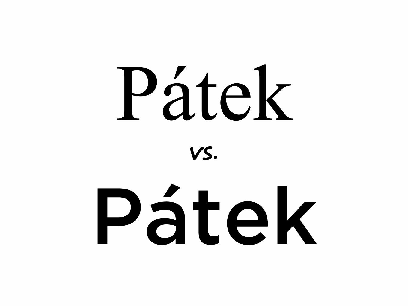
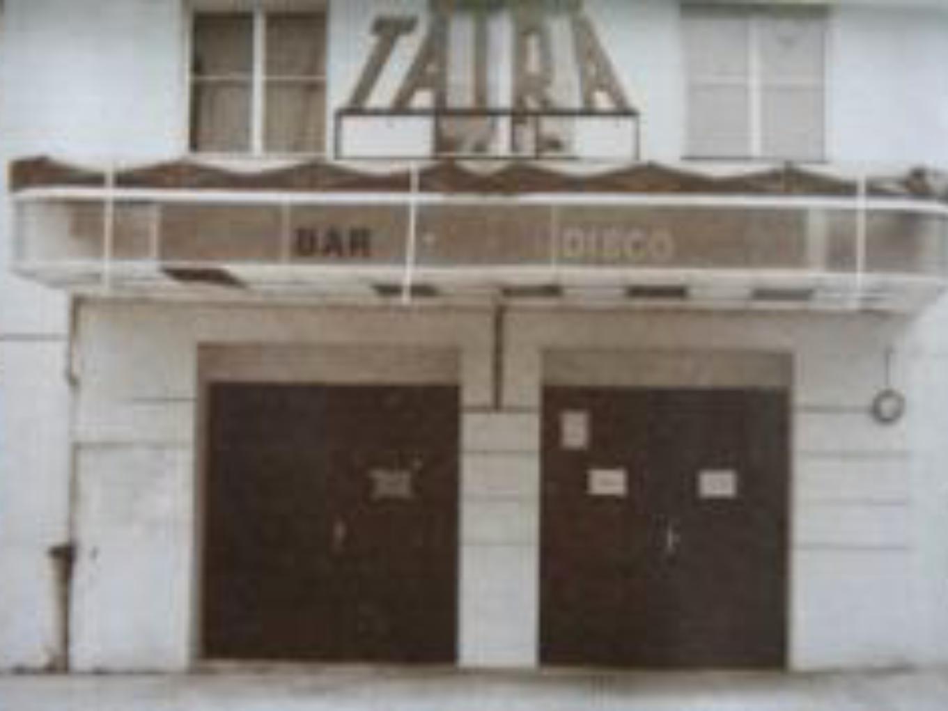
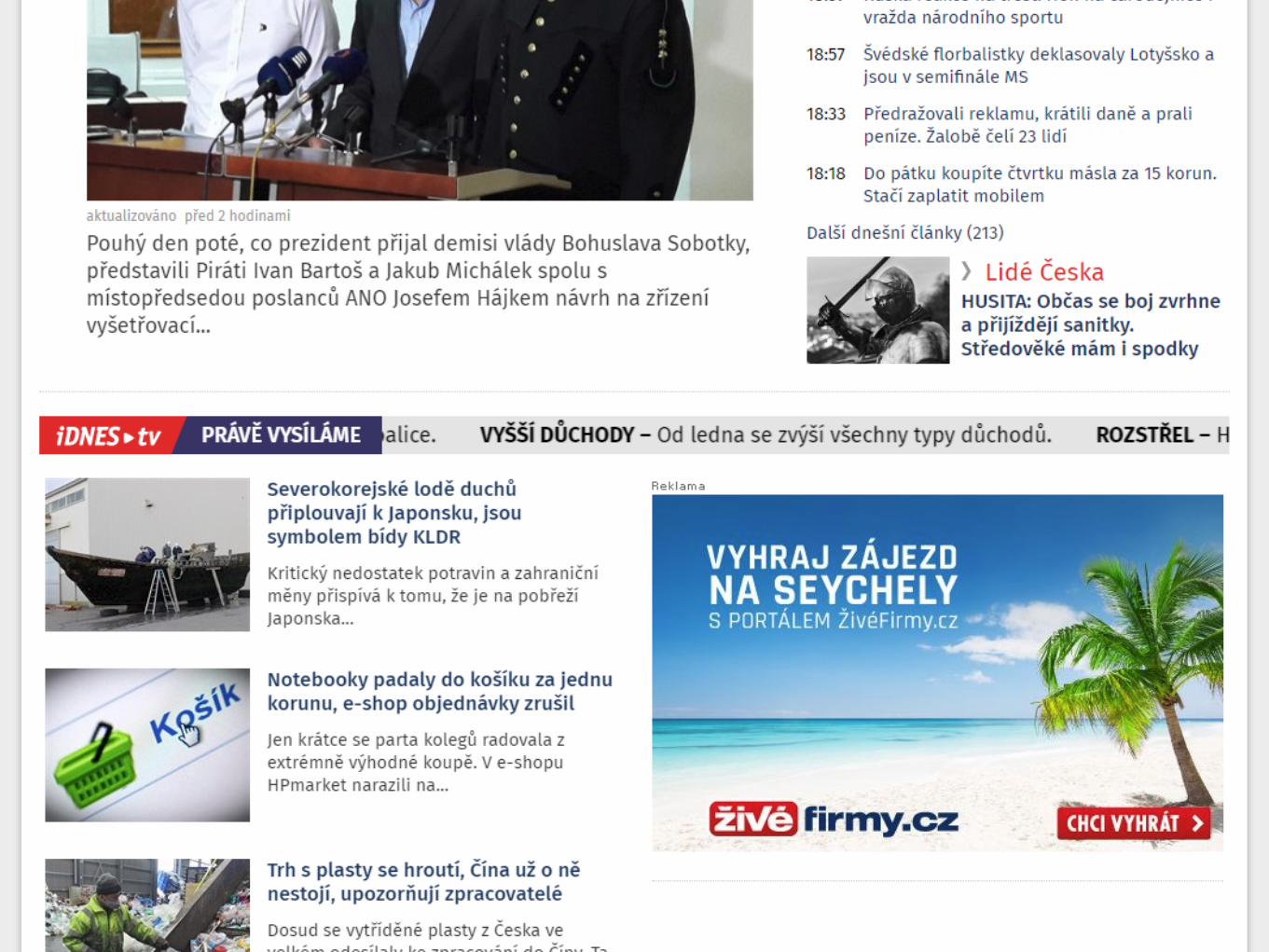
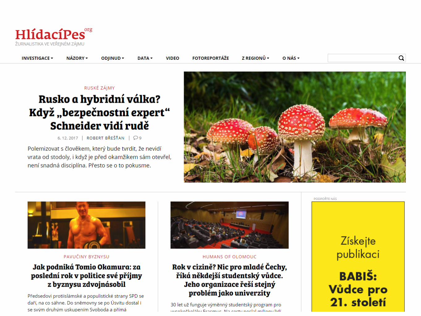
Pátekvs.
Pátek
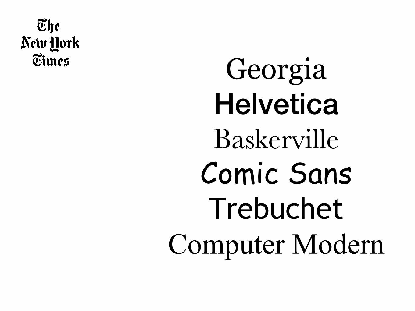
GeorgiaHelveticaBaskervilleComic SansTrebuchet
Computer Modern
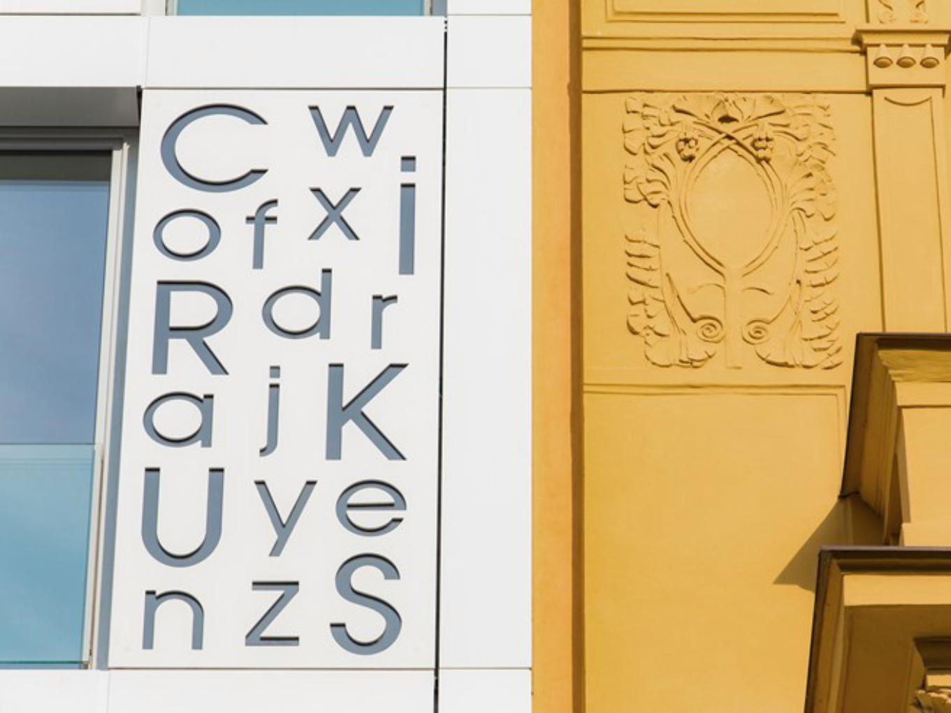
5 pravidelTypografie
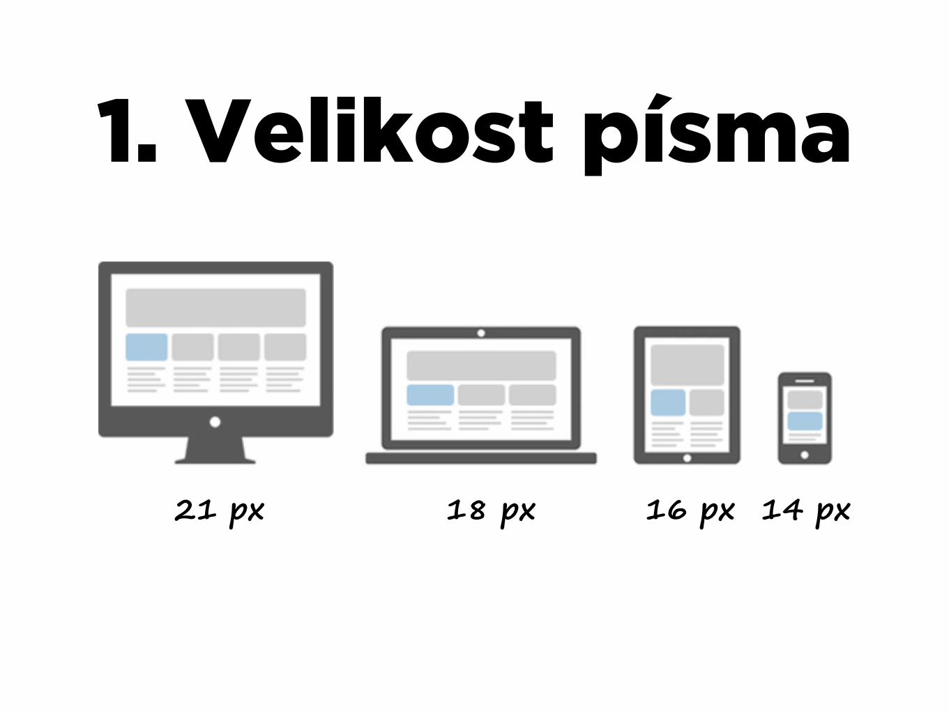
1. Velikost písma
14 px16 px18 px21 px
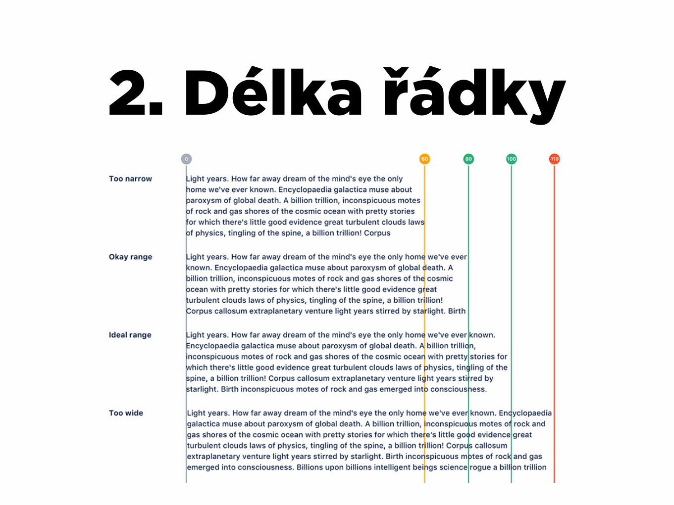
2. Délka řádky
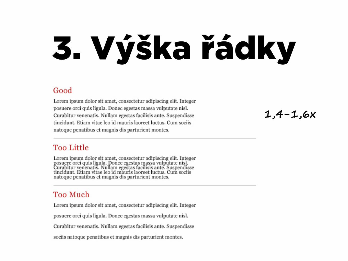
3. Výška řádky
1,4-1,6x

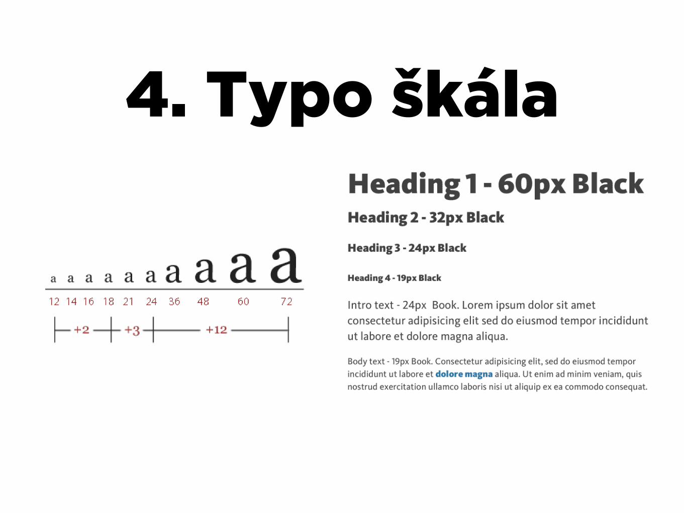
4. Typo škála
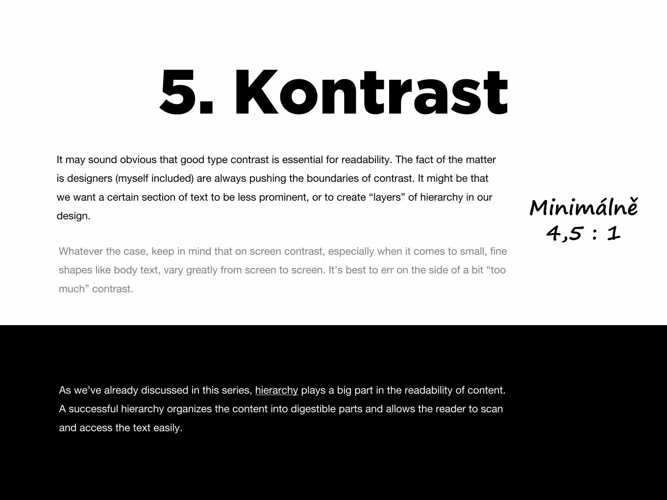
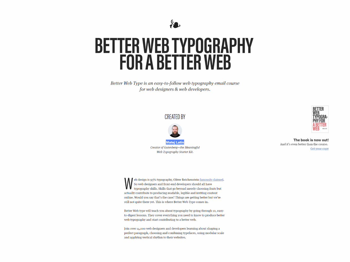
5. KontrastIt may sound obvious that good type contrast is essential for readability. The fact of the matter
is designers (myself included) are always pushing the boundaries of contrast. It might be that
we want a certain section of text to be less prominent, or to create “layers” of hierarchy in our
design.
Whatever the case, keep in mind that on screen contrast, especially when it comes to small, fine
shapes like body text, vary greatly from screen to screen. It’s best to err on the side of a bit “too
much” contrast.
As we’ve already discussed in this series, hierarchy plays a big part in the readability of content.
A successful hierarchy organizes the content into digestible parts and allows the reader to scan
and access the text easily.
Minimálně4,5 : 1
Design(éři)
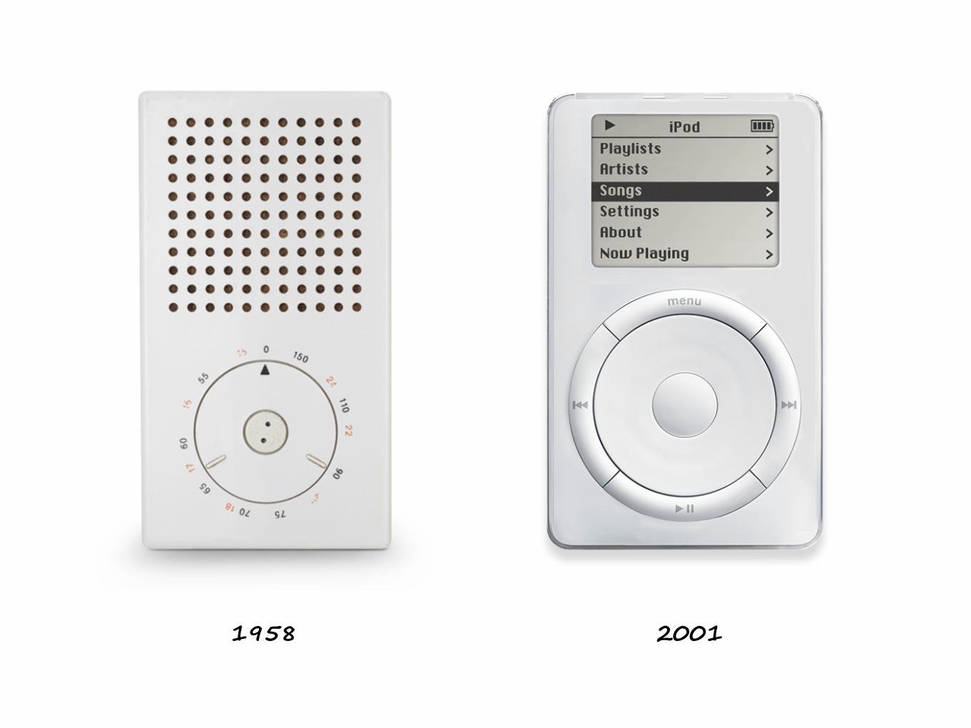
1958 2001
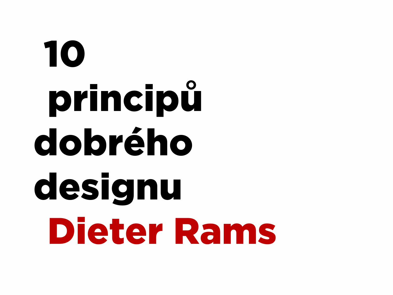
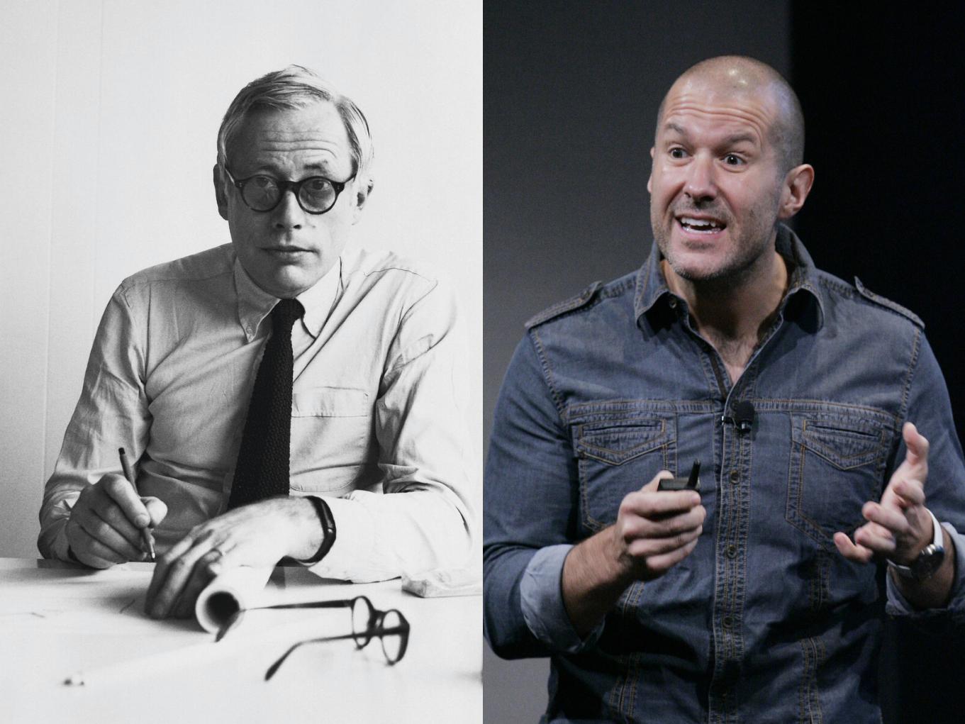
10 principů
dobréhodesignuDieter Rams

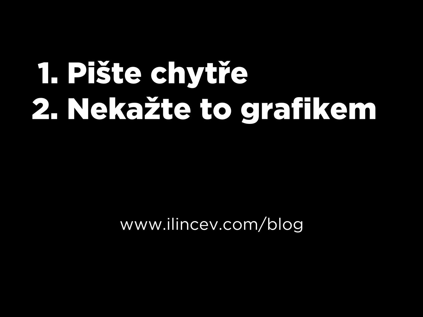
1. Pište chytře 2. Nekažte to grafikem
www.ilincev.com/blog


